Brand Refresh
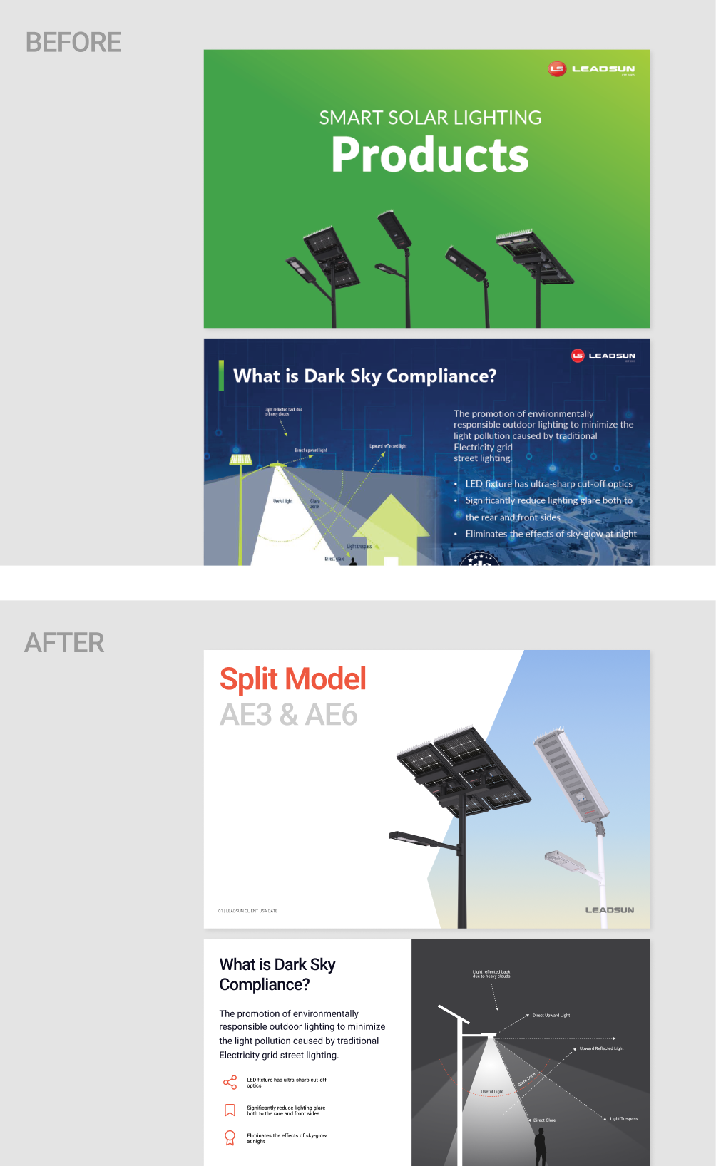
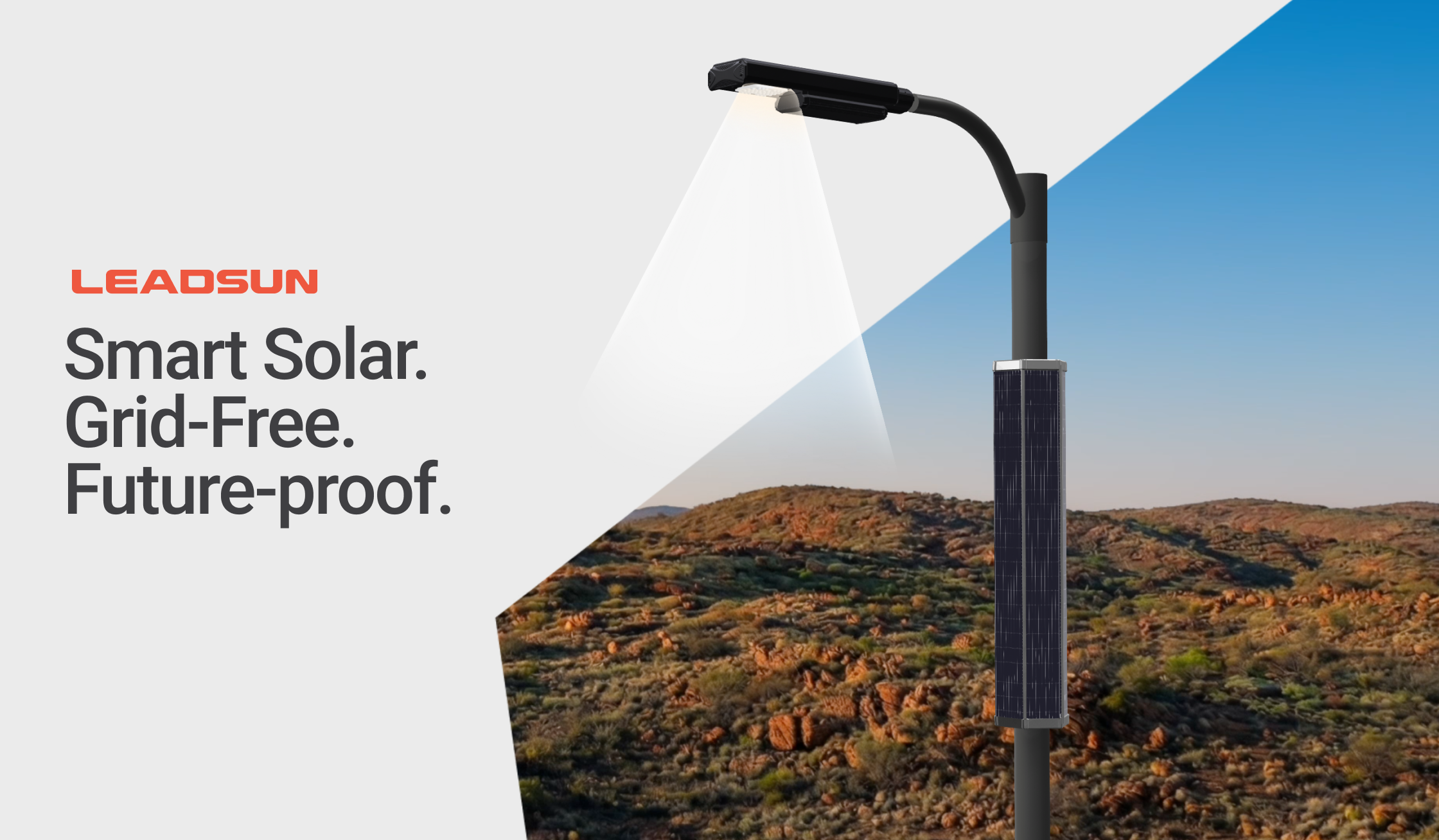
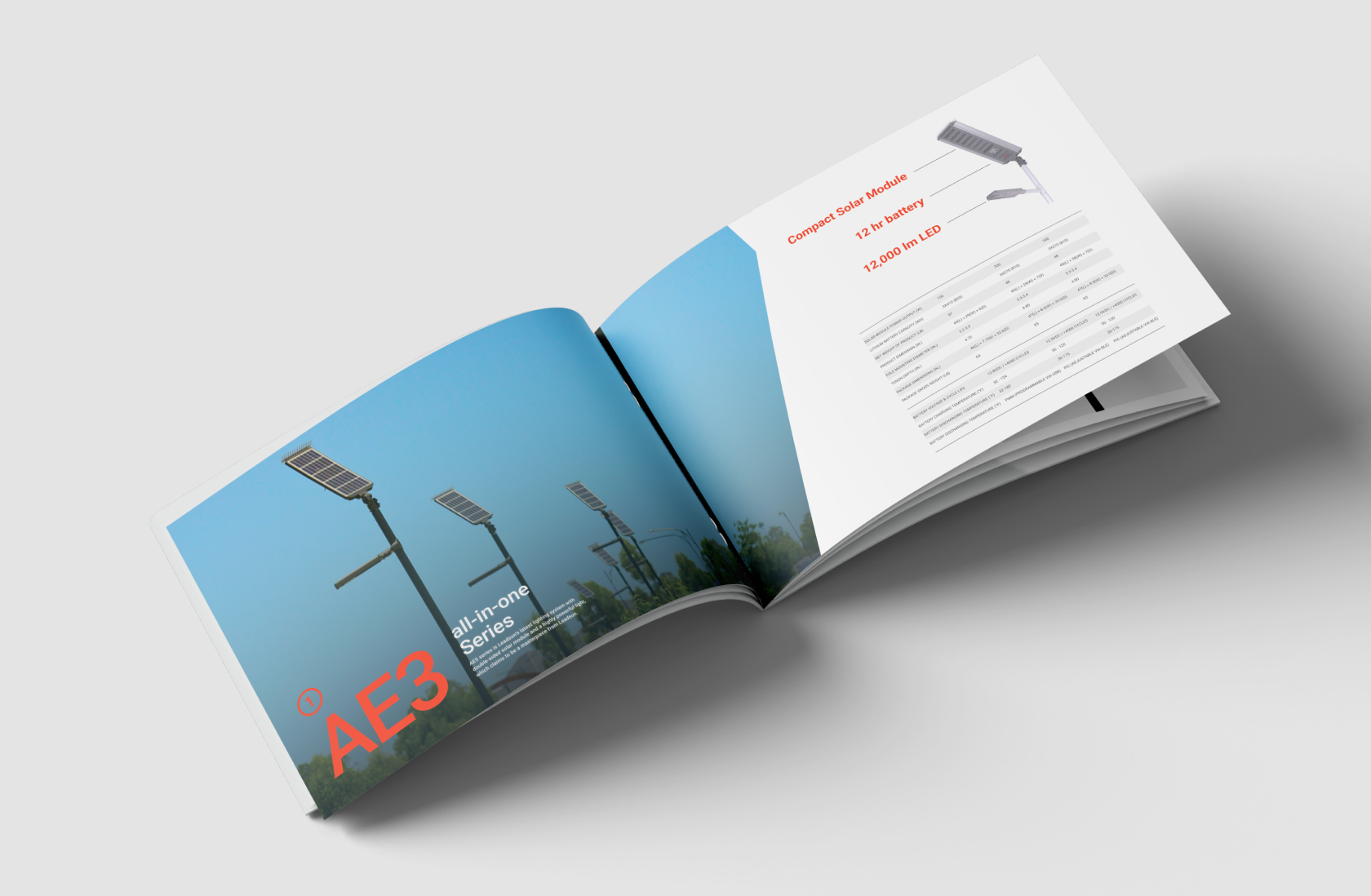
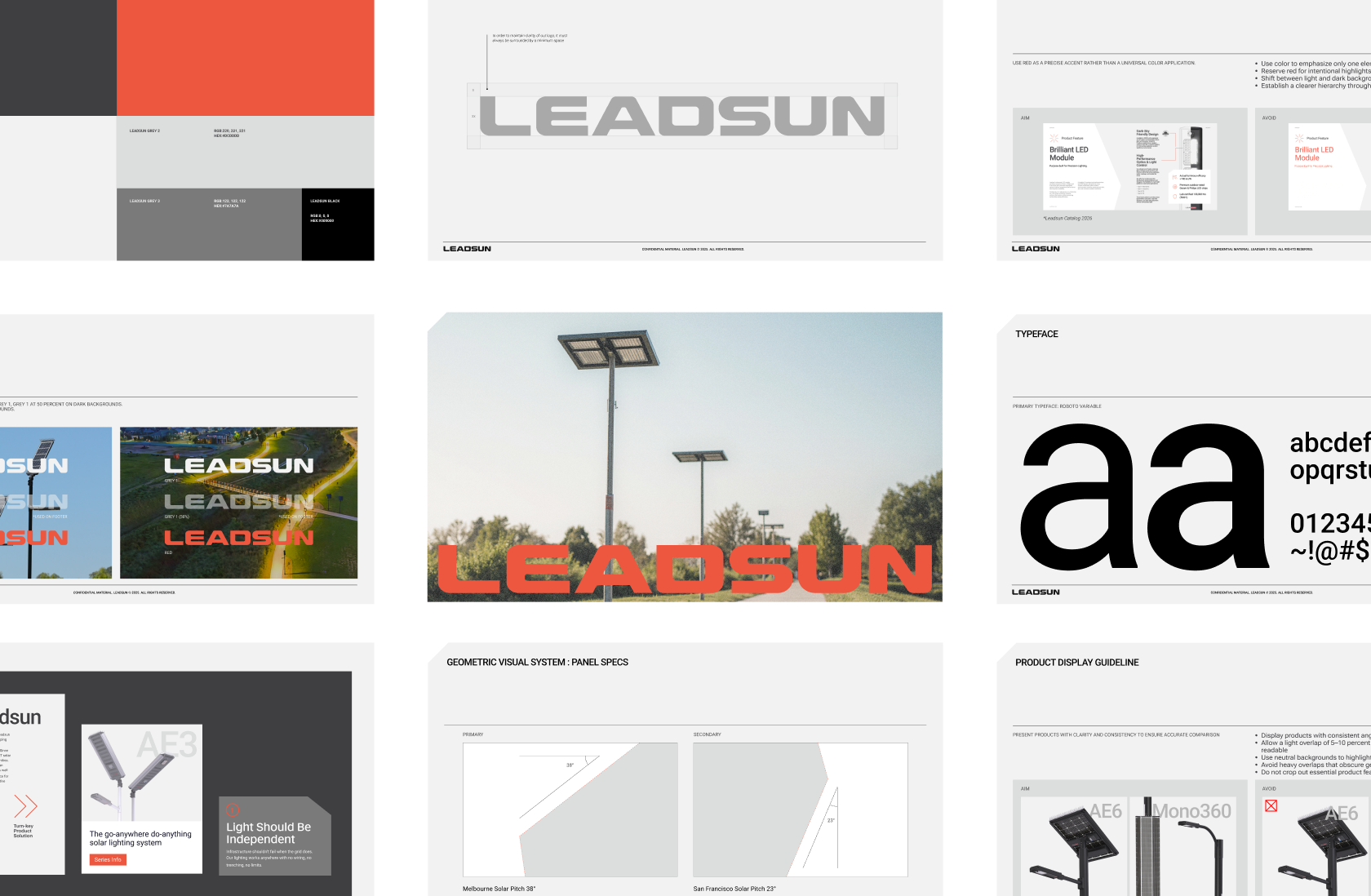
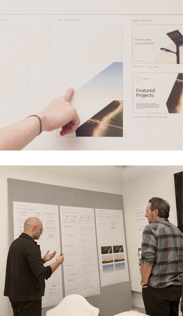
We built a new direction around one hero idea: the angled shape of a solar panel, set to the real solar pitch of Melbourne, Australia, where the company is based.
That shape runs through everything, carrying color, gradient, or a photo depending on the moment, so the brand holds together from a spec sheet to the website. We paired it with a simplified logo, type and color system, and editorial direction.
+